
Hiatus, Whereabouts, and Parlor Progress!
Wow! It’s now been way more than a minute! I know, things have been very quiet on this blog. It’s time to update you on whats behind the hiatus, my whereabouts, and report some progress! After what feels like a very long time (and multiple attempts to jump back in), I am finally refocusing on the house and quite excited to be posting about it.
Regarding my hiatus and whereabouts… I am deeply saddened to share that the primary reason things have been quiet, and I have been on a hiatus, is that I lost my Father in January. I had the honor and privilege of caring for him in his final months. Losing him has been a huge blow for me and I am still processing it all.
This being a house blog, I feel as though I have written more than enough posts about my personal life and difficulties. So… This post is about the house. I did write about Dad shortly after he passed, but rather than focus on that, I have chosen to post it here if you are so inclined to read about what happened.
Okay, back to Our Philly Row….

So! Let’s jump in and talk about the parlor! If you have been around a while, you will remember that I first began writing about our parlor back in 2017. And then several posts followed up on my plans, culminating in my June 2019 post “I Will Haz Gorgeous Parlor”… And then crickets…
Well… I am thrilled to write that there has finally been progress made in the parlor, and a lot more is on the way. The pace has been somewhat slower than I would prefer, but progress it is.
Now two and a half years post cancer surgery (and still cancer free! Yay!), I have learned that I simply cannot work as hard, or stay as focused, as I used to. Everything just takes longer. Honestly, it’s very frustrating because my brain remembers how I used to get things done, and my body won’t let me do it.
Okay, again… Back to Our Philly Row…. (Focus Devyn, focus)

Can we talk about the color?
Back in January of 2019, I wrote a two part post about my search for the perfect color for the parlor. When 132 Colors Aren’t Enough (Part I and Part II). I went into way too much detail about my 600+ day journey in search of the perfect color for our parlor. I started with a shade from Benjamin Moore (BM), but then leaned into my dream finding the perfect shade from luxury paint company, Farrow & Ball. Ultimately, I couldn’t find a F&B shade that worked, and went back to BM where I landed on the perfect color with an even more perfect name, Caldwell Green (HC-124). Who knew my surname would become the color of my parlor?

[Image: Our parlor in 2020… Not much changed in the past two years.]
From the beginning I considered doing the ceiling in a close but complimentary color. I even revealed a secondary color in my 132 colors post, Avon Green (HC-126). I then promptly dropped it (I still have a gallon of Avon Green in the basement). Ultimately, I settled on painting everything just one color, walls, trim, fireplace mantle, and ceiling… All Caldwell Green. Flat paint on the walls and ceiling, and satin on the trim and fireplace.
Now, here we are, three years later, and I have decided to revisit my original thought. I love dark and moody spaces painted in a single luscious color. They make me feel cozy and comforted (hmm, is this is my desire to return to the womb?).
Perhaps Caldwell Green on the ceiling was just a tad bit too dark for the entire room. Perhaps I needed a slightly lighter color for the ceiling, complementing the walls while retaining my love of dark and moody. Perhaps this was the opportunity to introduce a bit more boldness befitting my personality. Perhaps.

The final nudge came last fall when I had the privilege of staying at Stonyford, the home of Susan and Will Brinson (of House of Brinson) in the Hudson Valley. I was there for a weekend event as a participant on the True Tales From Old Houses Podcast with host Stacy Grinsfelder of Blake Hill House.It was quite an exciting weekend where I got to meet (in person) several internet friends, many of which I have known for years. I also got to sleep in one of the most fabulous guest rooms anywhere. They call the room “Queen of May“, and it most certainly lives up to it. Aside from sleeping on perhaps the most luxurious (and expensive) bed ever, I got the confirmation that I needed to move forward with the parlor.

Susan and Will decorated it five years ago for the One Room Challenge, and it remains, in my opinion, one of the most beautiful bedrooms I have ever seen. I was in awe of it back when they finished in 2017, and I never imagined that I would get to stay in it for a weekend. Susan is masterful at mixing high end with thrift store finds, but it was how she uses color that really takes it to the next level. The color combo she used (Farrow & Ball’s Inchyara Blue on the walls and Vardo on the ceiling) is stunning. The walls are a deep inky bold blue yet understated, while the ceiling is just bold. That was the confirmation I needed that it could work, no, it WOULD work.

Parlor Progress!
Of course, I am not going to copy Susan’s color combo, as beautiful as it is. The Caldwell Green train has already left the station. Even if I wanted to, any color related to teal is not allowed in our house because Yoav detests the color teal. And since he has ultimate veto power, that was never an option. So off to my local Benjamin Moore dealer to look at samples to go with Caldwell Green.
I was looking at something dark, but for a moment, considered that perhaps a muted pink would look good. I brought home a sample pot of Odessa Pink (#HC-59) and promptly slapped some samples up on several walls. Cue, BRAIN FART!… I quickly realized that the Odessa Pink is frighteningly close to the wall color we inherited from the previous owner, Jodi (which I call Jodi Peach). While the Odessa Pink does look nice with the green, I HATE Jodi Peach, and I don’t need or want to be reminded of it every time I look at my ceiling.

Clearly Odessa Pink was not going to happen. Back to the Benjamin Moore dealer I went. I considered a couple of blues, but they rang too close to teal, so it became clear that I needed to go with a green for the ceiling rather than an entirely different color. After standing at the sample wall long enough for staff to become concerned I may be moving in, I settled on two greens, bought sample pots of both, and came home.

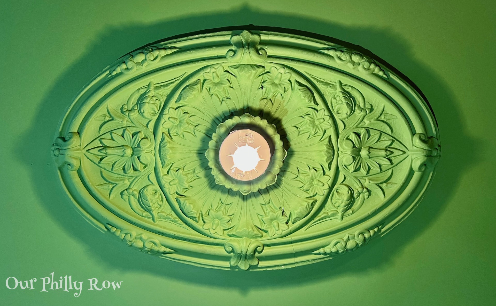
In the image above, you can see a peak of the Jodi Peach 🤮, followed by Odessa Pink, and my final two greens, Aurora Borealis (#565) and Southfield Green (#HC-129). The Aurora Borealis is definitely bold, but the Smithfield Green has it’s own punch when paired with the Caldwell Green.
So, which color did we go with? Well, as you probably know by now, I do nearly all of the decision making when it comes to decorating in the house while my wonderful husband just goes along with it. But… In addition to anything with teal, he actually has ultimate veto power over everything. That means if I really want something he is not thrilled about, I need to sell him on it. In the case of the two greens, I like them both, but I decided that he should have the final choice of ceiling color between the Aurora and the Southfield.
Thankfully, he chose the correct one. And the winner is Aurora Borealis.

A couple of weeks back, I started some painting and got a first coat on part of the walls and ceiling. The shot above shows work in progress, with a momentary clean up because we had company. I have other things to work on before I actually paint the whole room. But, these two walls and a partial ceiling give me wanted to get a feel for how the two greens work together beyond a swatch on the wall. As you can see from the very rough and incomplete paint job above, the Aurora Borealis is the perfect pairing with the Caldwell Green. It is bold, yet not crazy bold, and it is still a fairly dark color which will maintain my want for dark and moody.

So there you have it! Absolute final paint colors chosen and tested. Next post is super exciting. If you look closely at the photo above, there is a clue which reveals the topic of my next post. Any guesses are welcome in the comments below.

REALLY great to see this. Been wondering what you’ve been doing. Any time you’re stuck, feel free to come visit and rearrange my rental. Just signed lease to start year 5 here. Where does the time go? Stay well and keep us posted. 💙💙
Sending love and prayers my friend. Xo
There are no images showing your parlor. It sounds beautiful. Would love to see what you’ve done.
Hi Michele, Thanks for stopping by. 😊😊
There are two images of the parlor in the post, but I am holding back a bit as more is to be revealed soon. The project has gotten a slow start and will take longer than I’d like. But, after too long of a hiatus, it feels great to finally see what has been in my head for several years come to fruition.
The paint colors are lovely! Great choices!
Glad you are back! Just what I needed. I need to get some painting done too! Mine is more the “get the room scraped and plastered with a base coat” kind of thing. I always joke that it is so hard to get a room back to white/beige (lots of water damaged walls and ceilings in this place…). I love the greens!
I think I spy an installed medallion (!!) ? Either way, welcome back & can’t wait to see more reveals of your Philly row!
Dear Devyn and Yoav, I’m sorry for your loss. COVID is cruel on so many levels.
God bless.
I am also very sorry for your loss; you did all the right things in spite of these insane times. My pick, upon seeing your three potential ceiling options, was also Aurora Borealis… looks great! I look forward to the continued evolution of the parlor.
Devyn, good to see you healthy and once again working on your home. Progress on Gothichome has been slow but the warm weather has arrived so it’s back to windows and out side work.
Ron
[…] But here we are, and I am glad you are here, thanks for your patience. Last month I kicked off the restart of our parlor project and revealed a tweak to the paint colors and how they will work in the room, at the end of the post […]